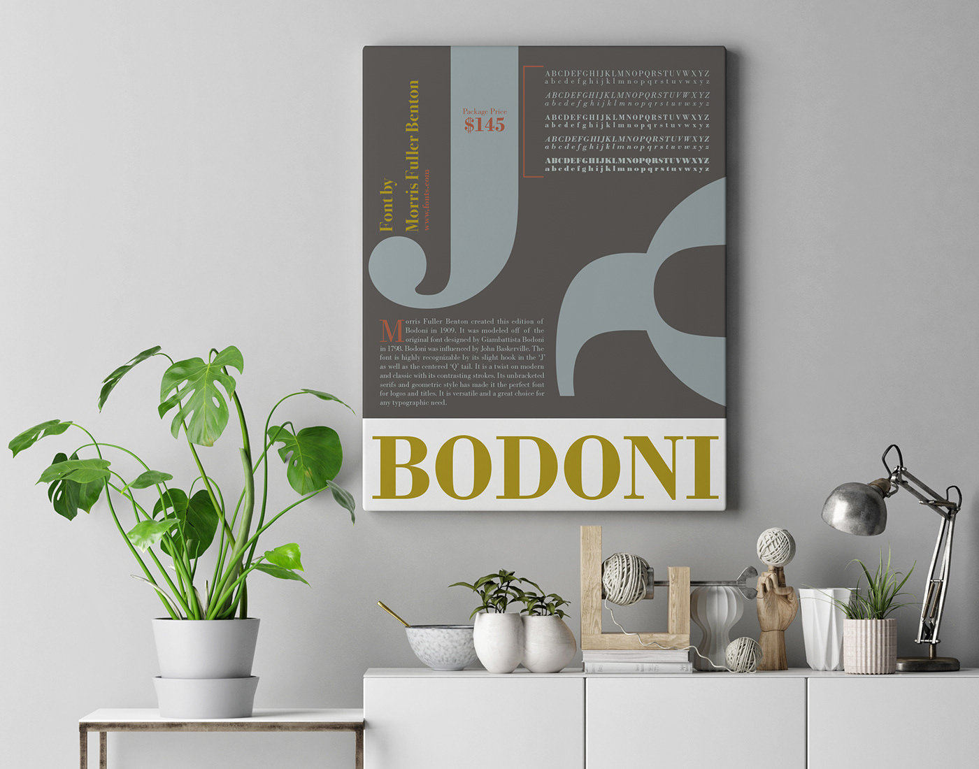
Eye Catching and informational Bodoni Poster used as decor in a home or office.
This poster is meant to be eye catching and informational. I designed the poster to not only be used for marketing, but to also be used as decor. The design was based off of Bodoni and its history. Colors were chosen from the era that this version of Bodoni was created.
Bodoni is highly recognizable by it’s slight hook in the ‘J’ as well as the centered ‘Q’ tail. It is a twist on modern and classic with its contrasting strokes. Its unbracketed serifs and geometric style has made it the perfect font for logos and titles. It is versatile and a great choice for any typographic need.
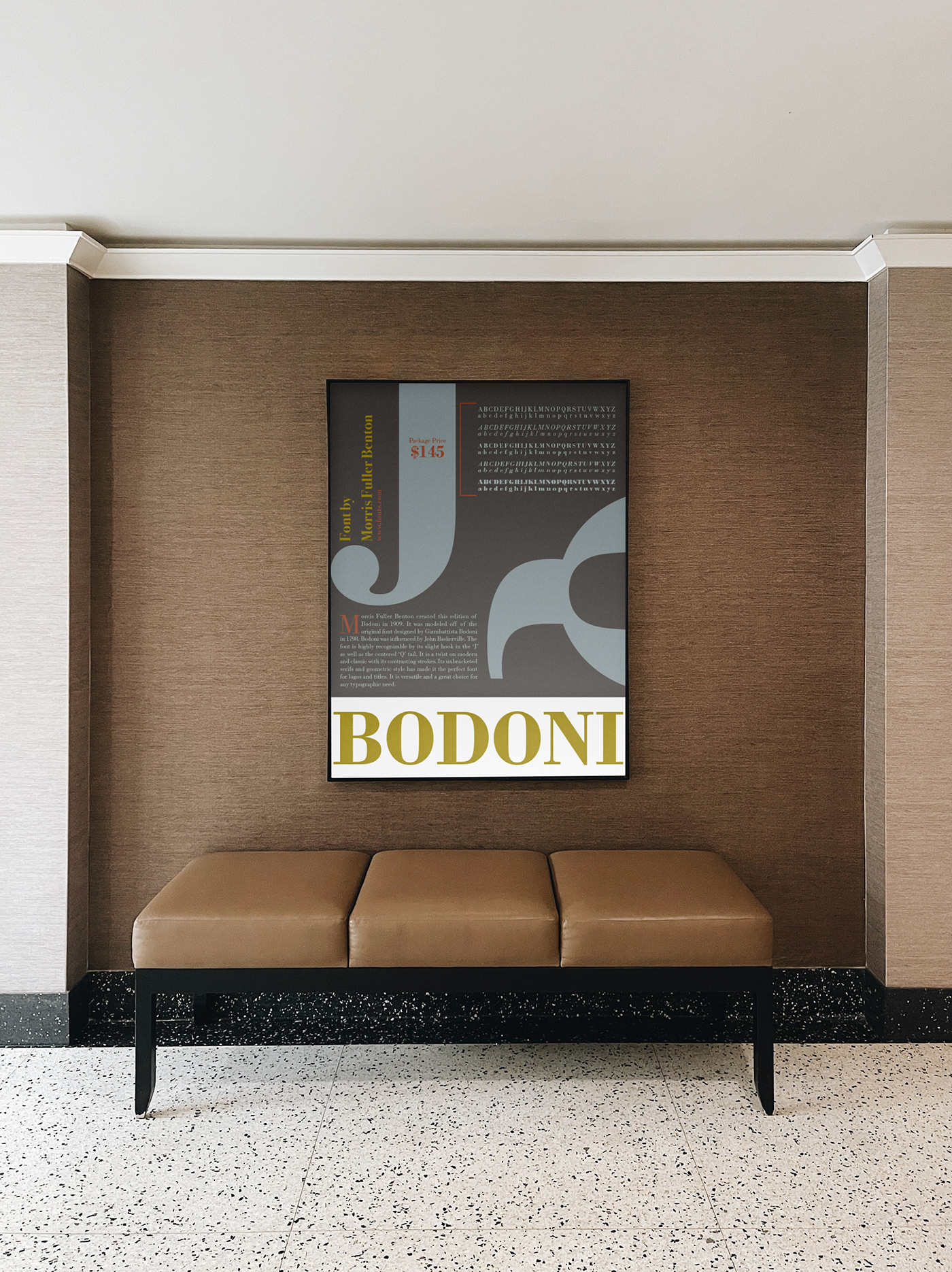
Bodoni Poster used as decor in a Hotel Lobby.

